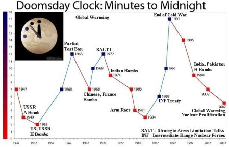
The Doomsday Clock from the Bulletin of Atomic Scientists Site

Doomsday Chart comparing various stressors.
This is a chart showing the relationships between outdoor air pollution, water pollution, malnourished people, A-bombs and the Doomsday Clock. It is very generalized but it is a point of departure from which a conversation can begin. The A-bombs start from a common level as a generalized comparison of the harm that they are capable of doing compared to air, water and famine on a world wide level. The countries possess nuclear stockpiles charted above are from date of first bomb to total destructiveness US, USSR, GB, FR, Ch, In, Is, Pk. The chart is based on the Probaway – Disaster Scale. At their top they are based on a Hiroshima level bomb and then multiplied by the number of bombs that the various countries obtained after that starting date to give an additive quantity of destructiveness. The USA and the USSR got into a suicidal contest and brought their number of weapons up to the point of total annihilation of humanity. So far the other countries have been more restrained seeking only deterrence or limited by resources.
Special Thanks And Courtesy To:


No comments:
Post a Comment